Responsive CSS Layout Grids without Media Queries

The foundation for many sites continues to be a layout grid, whether that’s composed of Grid or Flexbox. In this excerpt from Unleashing the Power of CSS: Advanced Techniques for Responsive User Interfaces, we’ll see how both of these tools provide ways to create fluidly responsive layout grids without media queries.
Responsive Layouts with Grid
First up is perhaps my favorite of all the solutions, because of its versatility and ease of use. Using Grid, we can create a responsive set of columns that create themselves as needed. We’ll provide a single constraint — a minimum width that columns can be — which does double-duty as a sort of “breakpoint” before column items break onto new rows.
The following video demonstrates the behavior we’re after.
Here’s all it takes to accomplish this responsive grid layout, where our minimum column size is set to 30ch via a helper custom property. This rule directs the browser to create as many columns as will fit that are at least 30ch wide:
.grid {
  --min: 30ch;

  display: grid;
  grid-template-columns: repeat(auto-fit, minmax(min(100%, var(--min)), 1fr));
}
Since 1fr is the “max” value of minmax(), the columns are also allowed to stretch to fill any leftover space equitably within a row. So, if the available space is 80ch and there are two grid children, they’ll each take up 40ch. If there are three children, the third will be on a second row, since 80 doesn’t divide equally into the minimum size allowed of 30.
The following CodePen demo provides a live example of a responsive Grid layout.
See the Pen
Responsive CSS Grid layout by SitePoint (@SitePoint)
on CodePen.
Responsive Layouts with Flexbox
We can accomplish a similar experience with Flexbox. The difference between the Flexbox and Grid solution is that grid items that flow to a new row can’t expand across multiple grid columns. With Flexbox, we can direct the flex items to grow to fill all remaining extra space, preventing an “orphan” that appears with the Grid solution.
In this code, as in the Grid code, the browser will create as many columns as will fit the inline space with at least the --min size of 30ch. If we have three items and the third needs to move to a new row, it will take up the remaining space due to the flex shorthand, which importantly sets flex-grow to 1. It therefore has a similar behavior to 1fr in most cases:
.flexbox-grid {
  --min: 30ch;

  display: flex;
  flex-wrap: wrap;
}

.flexbox-grid > * {
  flex: 1 1 var(--min);
}
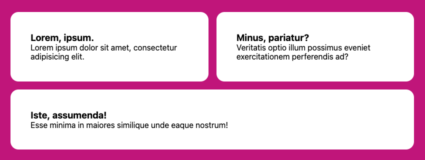
The image below shows the final, odd-numbered list item spanning two columns, thanks to the flex-grow property.
Note: in both the Grid and Flexbox solutions, if we add a gap, that space will be subtracted from the calculation of how many columns may be created before new rows are added.
Keen readers may have noticed another key difference between these solutions: when using Grid, the parent defines the child behavior. For Flexbox, we set the child layout behavior on the children. The flex shorthand sets, in order, flex-grow, flex-shrink, and flex-basis.
As an experiment, we can change the flex-grow value to 0 and see how the items will only expand up to the flex-basis value. (Experiment with the CodePen demo below.) It’s important to keep flex-shrink to 1, so that, eventually — when the available inline space is narrower than the flex-basis — the items are still allowed to “shrink”, as this helps to prevent overflow.
The following CodePen demo shows our Flexbox layout in action.
See the Pen
Responsive Flexbox Grid layout by SitePoint (@SitePoint)
on CodePen.
The flex-basis property can be further adjusted for this solution to assign unique “breakpoints” for different items. Since we’re setting that value via the --min custom property, and Flexbox children control their own size, we can adjust it with an inline style:
<li style="--min: 40ch">...</li>
The other list children in this example will still flow around it and use the 30ch from the base rule, but the wider column effectively changes the behavior.
Here’s a CodePen demo of this code in action.
See the Pen
Responsive Flexbox Grid layout – adjusted –min by SitePoint (@SitePoint)
on CodePen.
Here are two other Flexbox techniques that use flex-grow and flex-basis in interesting ways:
- Heydon Pickering’s Flexbox Holy Albatross, which breaks down from columns into a single row based on the parent container’s total width.
- Heydon Pickering’s and Andy Bell’s sidebar layout, which shows how to force varying Flexbox-based breakpoints for better control of when items wrap.
This article is excerpted from Unleashing the Power of CSS: Advanced Techniques for Responsive User Interfaces, available on SitePoint Premium.