AtoZ CSS: Creating Responsive Design with Media Queries
This article is a part of our AtoZ CSS Series. View the full screencast and transcript for Media Queries here.
Welcome to our AtoZ CSS series! In this series, I’ll be exploring different CSS values (and properties) each beginning with a different letter of the alphabet. We know that sometimes screencasts are just not enough, so in this article, I’ve added a new quick tip/lesson about media queries for you.

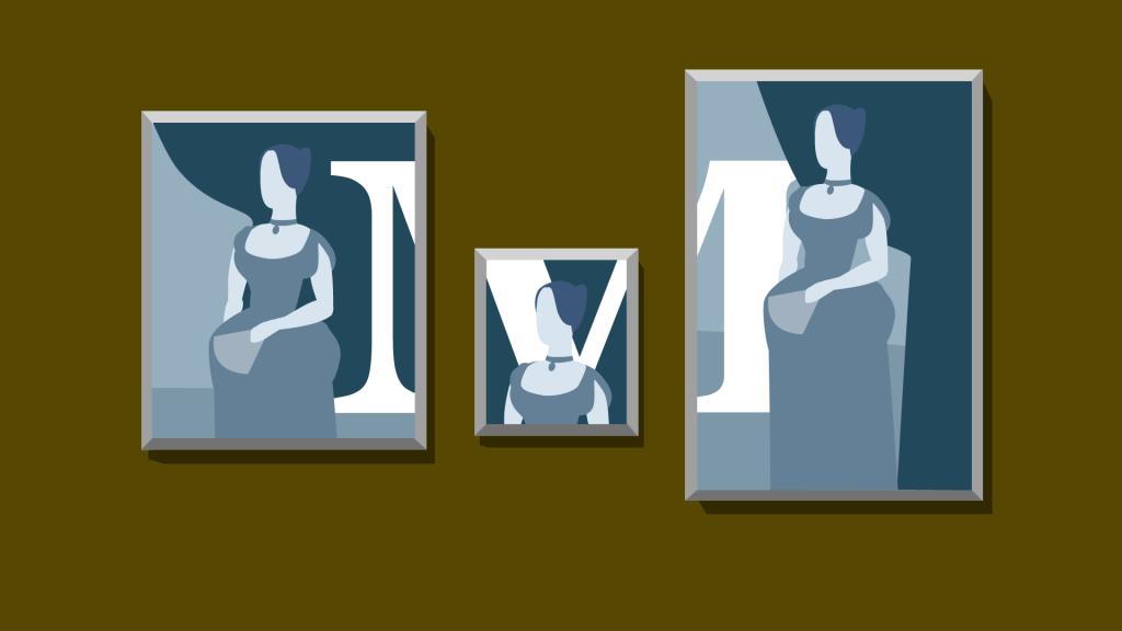
M is for Media Queries
I would venture a guess that the vast majority of web designers and developers are familiar with the concept of responsive design these days. If not, check out the Media Queries screencast.
Since responsive design is so popular, it’s a good place to pick up a couple of tips for improving the way we develop websites and apps for multiple devices. Here are a couple of CSS tips to help you out.
Tip 1: Don’t use device specific breakpoints
Hopefully this goes without saying, but just in case you need a reminder or you haven’t come across this best practice before, I thought it was worth reiterating.
Device specific breakpoints are easily identified in your code with media queries that look like this (comments added for clarity):
/* ipad portrait */
@media screen and (min-width: 768px;) {}

/* ipad landscape */
@media screen and (min-width: 1024px;) {}

/* iphone */
@media screen and (min-width: 320px) and (max-width: 480px;) {}
These breakpoints have been set up for Apple devices and have “magic number” values such as 768px or 1024px.
What if a user’s window is 1025px or 1023px?
The media queries wouldn’t take affect and the styles for that device size would not apply.
Sometimes you may need a very specific value for your breakpoint (more on that in a second) but seeing these device specific breakpoints is a code smell as far as I’m concerned.
So what should you do instead?
Tip 2: Set major breakpoints and minor tweakpoints
When working on a responsive project, I tend to set arbitrary whole-number breakpoints that are approximately the dimensions of the majority of phones, tablets, and desktop/laptop devices.
I would tend to use the following major breakpoints (although sometimes this may be altered on a project by project basis):
/* large phones and small tablets */
@media screen and (min-width: 500px;) {}

/* tablets and small monitors */
@media screen and (min-width: 800px;) {}

/* laptops and desktops */
@media screen and (min-width: 1200px;) {}
Using these breakpoints doesn’t limit the design to only change at these points but gives a good foundation for working with the three major device types.
For content-based tweaking of the design (ie: when the content starts to look broken, unbalanced, or doesn’t quite fit) you can then use tweakpoints to nudge elements around and polish the details of your project.
/* tweak position of share button */
@media screen and (min-width: 1150px;) {
  margin-right: 1em;
}
Tip 3: Use em or rem as your breakpoint units
Instead of px, use one of these relative units for better scalability if the user zooms the page or increases the size of the text. As an example, my major breakpoints above would look as follows when sized in ems.
/* 500px / 16px = 31.25em */
@media screen and (min-width: 31.25em;) {}

/* 800px / 16px = 50em */
@media screen and (min-width: 50em;) {}

/* 1200px / 16px = 75em */
@media screen and (min-width: 75em;) {}


