Create a Colorful Image Slider in Photoshop

Image sliders are quite popular in the world of web designing. It’s a great way to showcase your imagery, and it captures the attention of your visitors instantaneously. So, today I’ll walk you through the process of designing a stylish web slider in Photoshop. We’ll use the pen tool, different shape tools, and layer styling techniques for the creation of this slider. Let’s get started!
Resources:
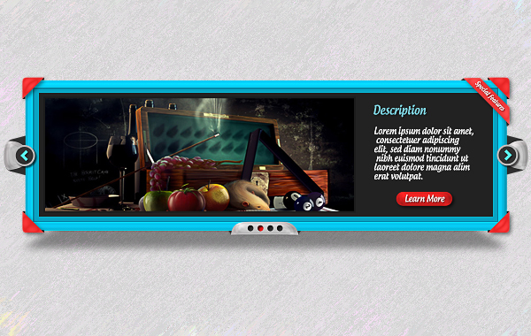
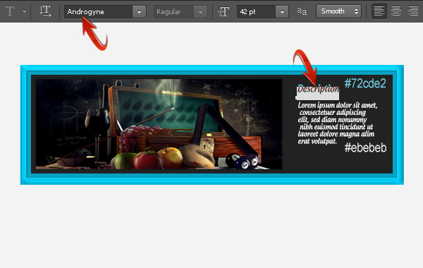
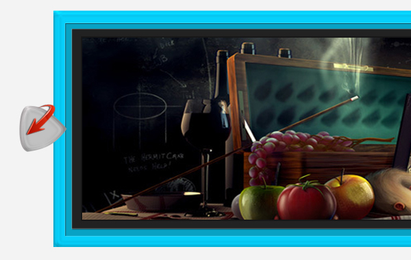
Final result:
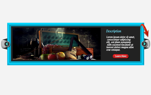
Before we start, let’s look ahead at our end result:

Step 1
Create a new document in Photoshop with an 1100px width and a 650px height.

Step 2
First of all, we’ll make the frame for the slider. Set #06d0fb as your foreground color and select the rectangle tool to draw a rectangle with a 960px width and a 300px height.

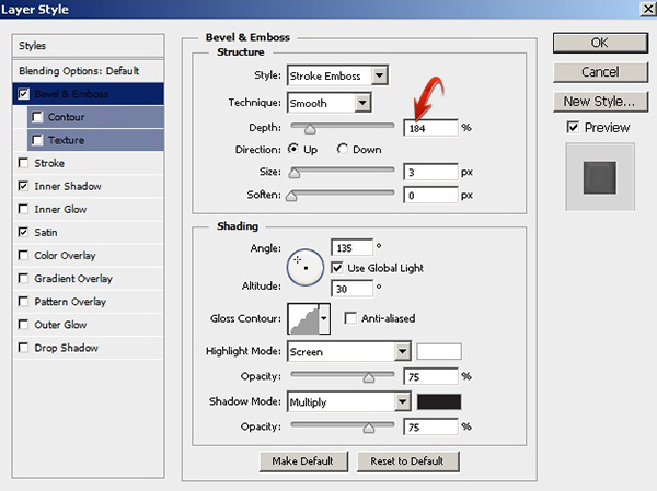
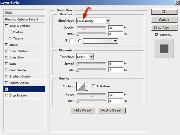
Step 3
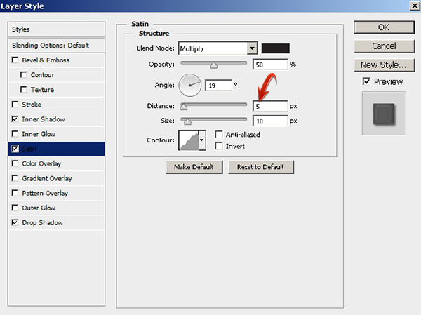
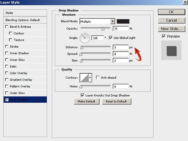
Double-click on the rectangle layer to open the “Layer Style” window. Apply the following layer style settings.


Step 4
Create another rectangle with a 926px width and a 270px height. Use color #08a2c3 for this rectangle.

Apply the following layer style settings for this rectangle.


Step 5
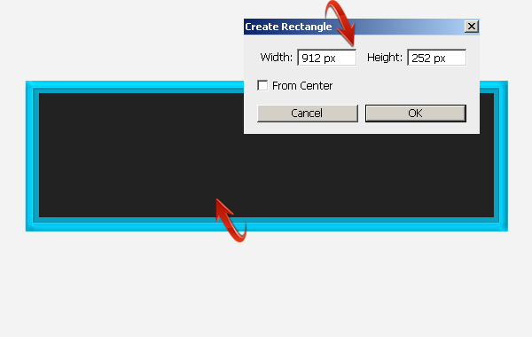
Create a third rectangle with a 912px width and a 252px height. Use color #222222 to fill the rectangle.
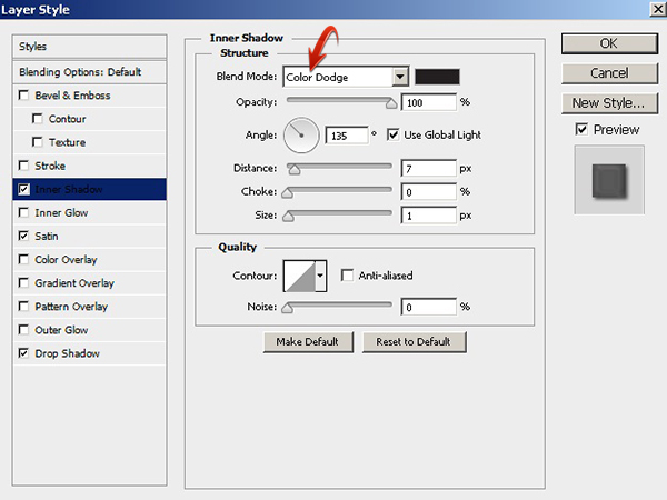
Step 6
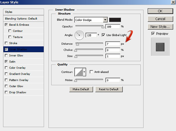
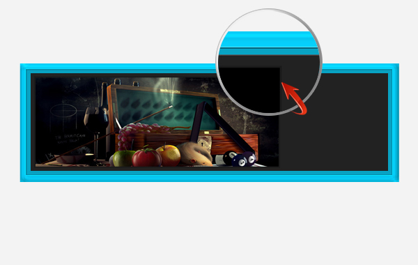
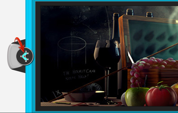
Open the image file in Photoshop, and drag it to the slider document. Resize and position it at the top of the layers using the free transform tool (Ctrl + “T”).
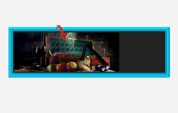
Double-click on the image layer and use the following settings to apply a stroke.

Step 7
Now, select the type tool to type in text on a new layer. I am using a font called “Androgyne” here.
Step 8
Next, we’ll create a button. To do so, set #e32121 as your foreground color and draw a rounded rectangle using the rounded rectangle tool.

Step 9
Apply the following layer style settings on the layer containing your red button.


Step 10
Now we’ll add some text, which we want over the button. Use the following settings for to apply a drop shadow to this text.
Right-click on this red button text layer and select the option of “Copy Layer Style.” Then, right-click on the “Description” text layer and select “Paste Layer Style” to apply the same drop shadow settings.

Step 11
Next, we’ll add slider controls. For that, select the pen tool to draw the shape shown below. Make sure to select the “Shape” setting in the properties bar. Use color #c1c1c1 to draw the shape.
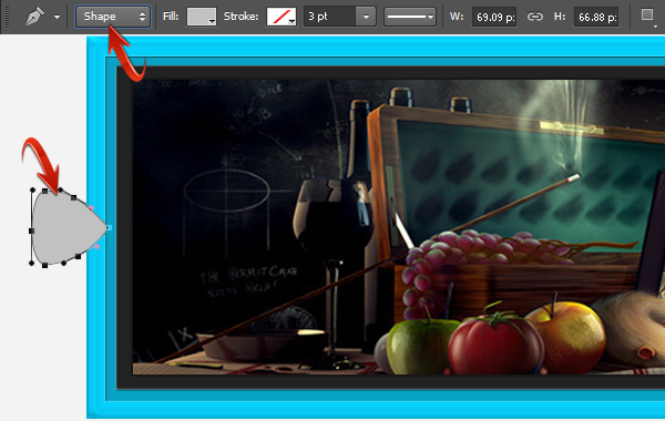
Now, copy the layer style of the red button layer and paste it onto this newly-drawn shape layer to get the effect shown below.
Now, let’s make the backside of this new shape. Draw two rounded rectangles using color #2e2e2e, and drag them below the rest of the layers. Arrange them at an angle—as shown below—using the free transform tool (Ctrl + “T”).

Step 12
Select the ellipse tool with “Shape” tool mode to draw an ellipse at top of your layers layers. Use #313131 as a fill color and #c1c1c1 for a 2px stroke.
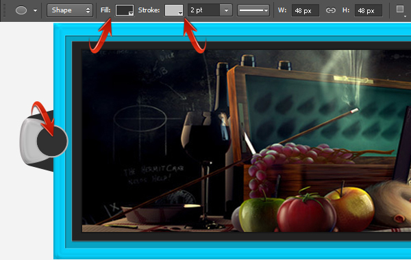
Apply the following settings for drop shadow.

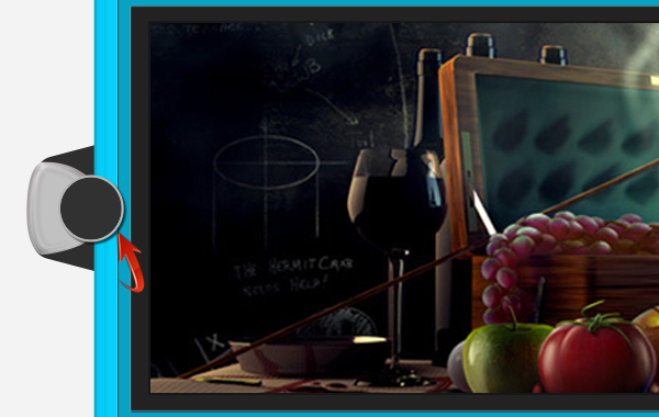
Step 13
Now, set #57fff5 as your foreground color and draw an arrowhead using the pen tool.
Step 14
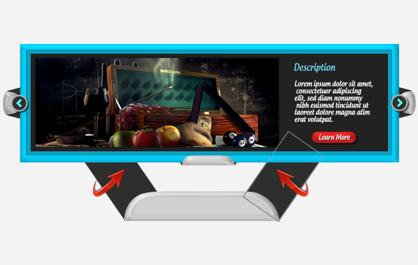
Collect the layers forming the frontmost parts of slider control into a group, and collect the backside of your slider controls into a separate group. Now, duplicate both these groups and flip them horizontally by going to “Edit” > “Transform” > “Flip Horizontal” and arranging them on the right side of slider. The result is shown below.
Step 15
Next, to make slider navigation, draw the shape shown below using the pen tool. Use color #d1d1d1.

Now, copy the layer style of the red button layer and paste it on this new navigation layer. To make its backside portion, draw two rectangles on a new layer just above the background and arrange them at an angle, as shown below.
Step 16
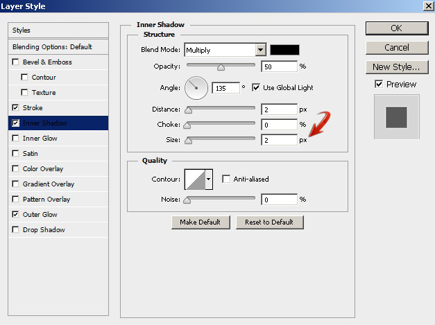
To complete the navigation, make four ellipses of equal size and arrange them as shown below.
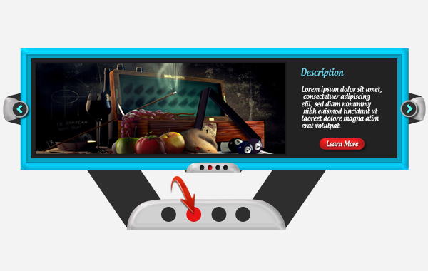
Add an inner shadow to these four ellipses with the following values.


Step 17
The basic layout of our slider is almost ready. Now, we’ll add few more items to make it more interesting. Draw the triangular shape shown below and paste the red button layer style onto it.

Now, draw two triangles in pitch black (#000000) to complete the corner cover.

Step 18
Collect the corner cover layers into a group and duplicate it three times. Arrange these three groups at different corners by rotating them one by one at the angles and positions shown below.
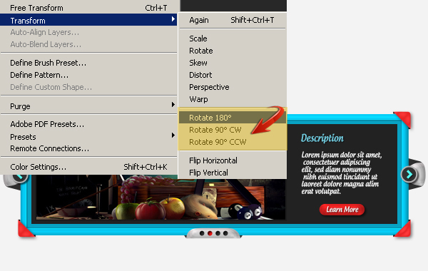
Step 19
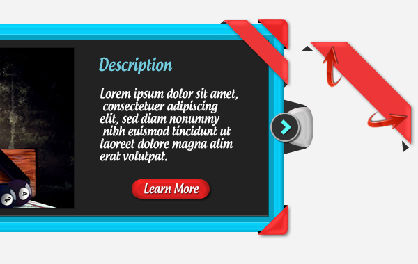
Now, make a ribbon for the top-right corner, as shown below.
 Apply the following layer style settings on this new ribbon layer.


Step 20
Add some text over the ribbon, and paste the drop shadow settings from the red button text layer onto the ribbon layer.

Step 21
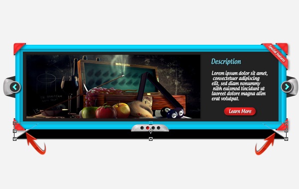
Lastly, we’ll make shadow for the entire slider. Make a rectangle in pure black (#000000) just above the background layer and go to “Edit” > “Transform” > “Distort.” Use it to make rectangle shape like the one below.
Step 22
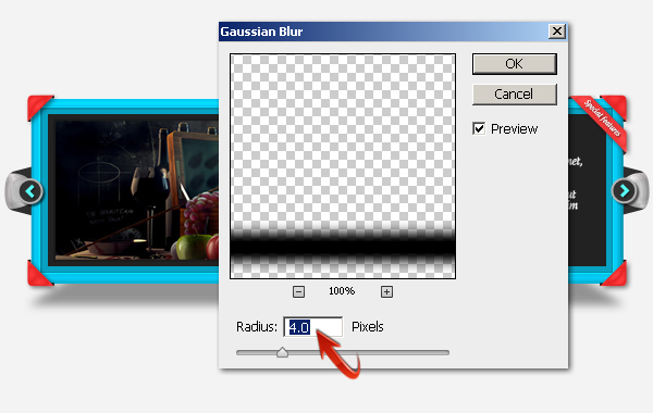
Now, right-click on the shadow layer and select the option of “Rasterize Layer,” and go to “Filter” > “Blur” > “Gaussian Blur.” Use the following values for the Gaussian blur, and reduce the opacity of this shadow layer to 40% to get the desired effect.

That’s it guys. I hope you like it and learned something useful. Let me know what you think!