IDEO Font Map: A Faster Way to Find the Best Google Fonts

Navigating by chart.
How do you deal with responsive typography? Check out chapter 4 of Chris Ward’s new book, ‘Jump Start Responsive Web Design, 2nd Edition‘.
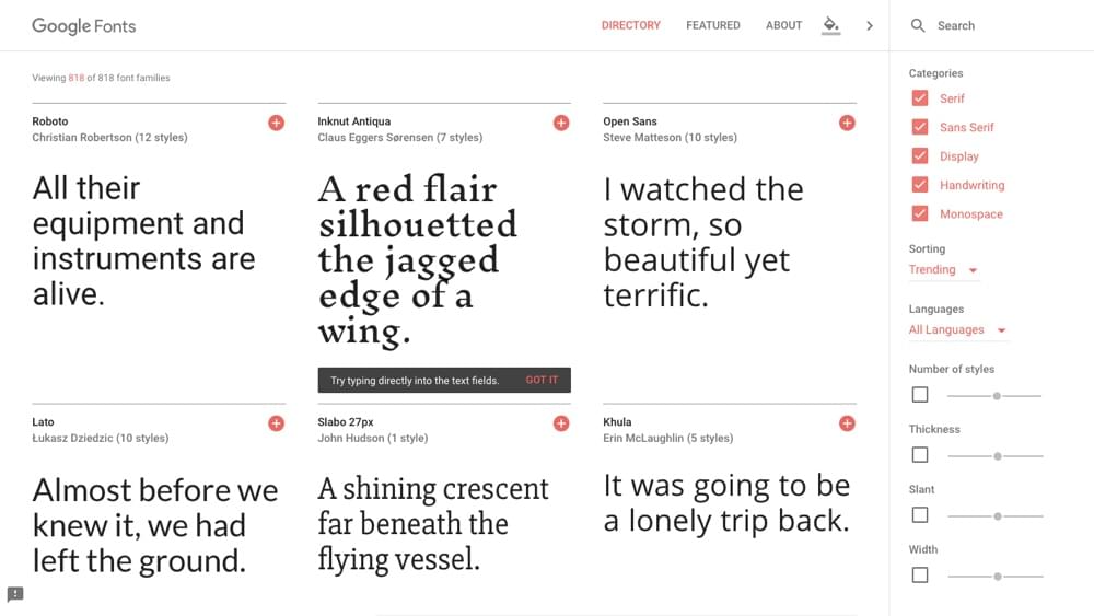
Google Fonts offers a vast and varied collection of easily embeddable web fonts. 818 fonts to be exact! But how do you find the right font for your web design out of 818 options? Even if you’re using the search filters (Serif, Sans Serif, Display, Handwriting, Monospace, etc) to narrow down the results, often enough, you’ll still end up browsing through a series of non-contenders before you find the right one. Picking fonts can be very time-consuming!
Enter the IDEO Font Map, which intelligently uses machine learning to group similar (Google) fonts together on a digital interactive map. Let’s see how the IDEO Font Map compares to using Google Fonts directly.
Google Fonts vs. IDEO Font Map
Even though Google Fonts is a delight to use (its interface is refreshingly clean), finding the perfect font can take quite a bit of time, because the sorting of the search results is random. Also, the navigation is linear — there’s only one direction that you can go, and scrolling is the only way to get there. It’s a matter of scrolling, scrolling, scrolling until you find the font that you need, and, if you find a font that almost fits the bill, there’s no “browse similar” function.
Not very time-efficient.
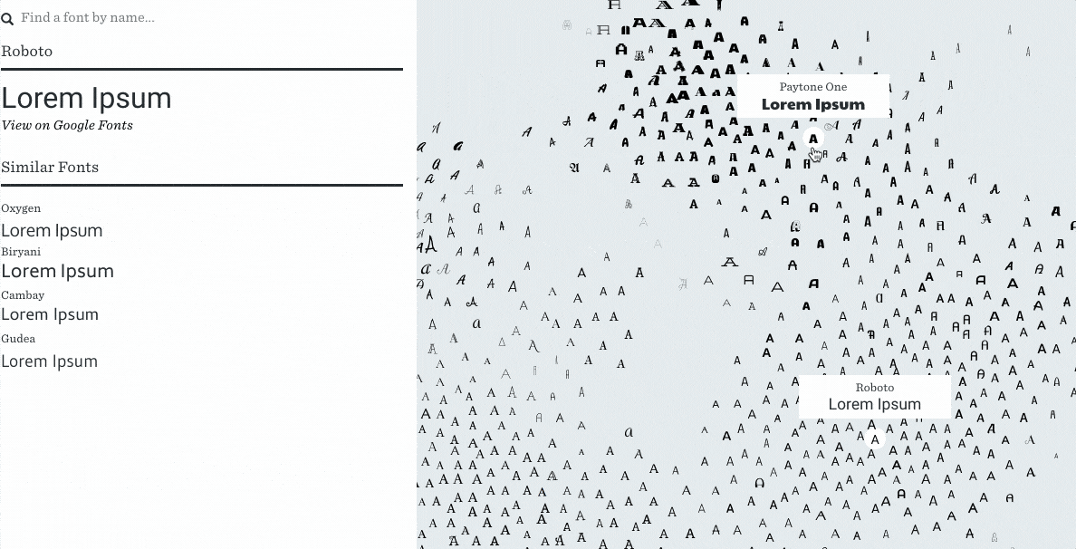
With machine learning, Font Map is able to visually distinguish one font from another and carefully display each one on a digital canvas (reminiscent of an old, vintage, hand-drawn map).
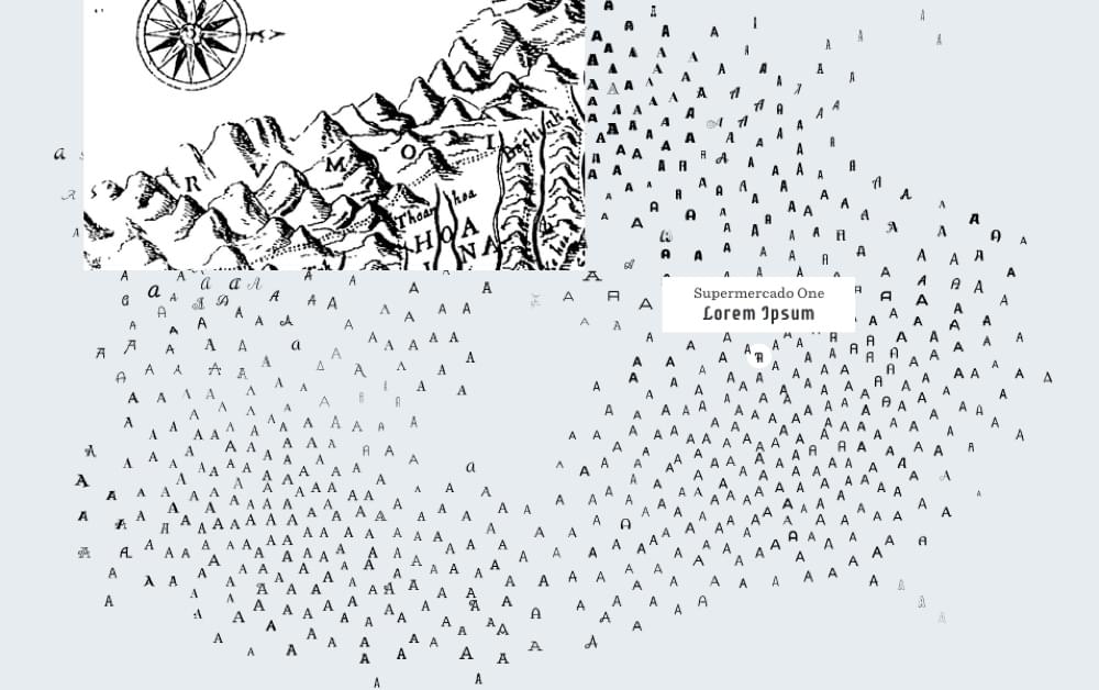
Imagine the map as a country, where the font samples are the locals. As you travel between the different lands, the local dialect changes very slightly. In this example, the dialect is a metaphor for the different fonts that are spread across the map.
In the south-west region lives the sophisticated serif fonts, and in the south-east, modern sans-serif fonts. As you travel north, the fonts start to become a little rougher around the edges. You’ll find the whimsical handwritten fonts in the north-west regions, and the wacky display fonts in the north-east.
Interesting observation: since a font cannot be both serif and sans-serif, there’s an empty space in the middle of the map!
Going on a Quest to Find the Perfect Font
Start by doing a quick eye-scan of the map to find a font that sort of resembles what you’re looking for (or if you already have a font mind, type it in the search bar on the left). Then, observe the surrounding fonts and choose something that’s similar, but fits the bill a little better. With each “step” you should draw closer and closer to the font you’re looking for!
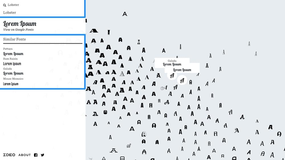
Tip: when you select a font, you’ll see “Similar Fonts” in the sidebar along with the font name and some lorem ipsum sample.
Conclusion
With the IDEO Font Map, you have a clear direction (and a map to get you there!). With Google Fonts, you’re scrolling and hoping for the best. The end result is the same, but Font Map could help you choose a font faster.
How do you deal with responsive typography? Check out chapter 4 of Chris Ward’s new book, ‘Jump Start Responsive Web Design, 2nd Edition‘.


